Acuverse.
Overview
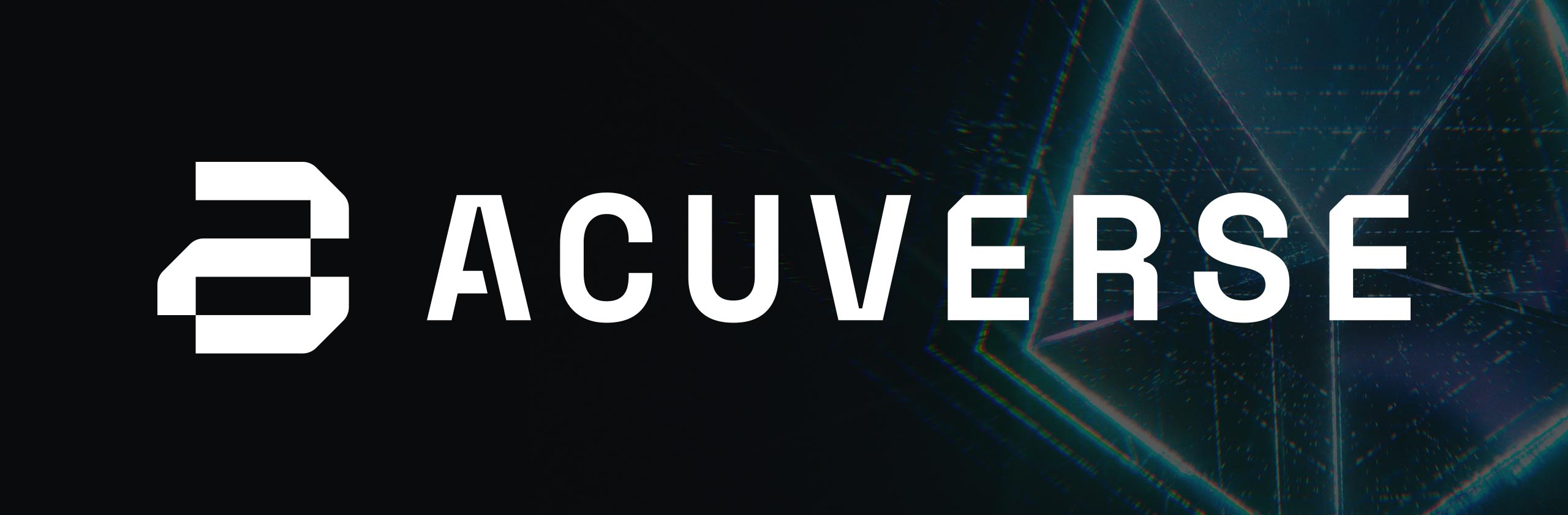
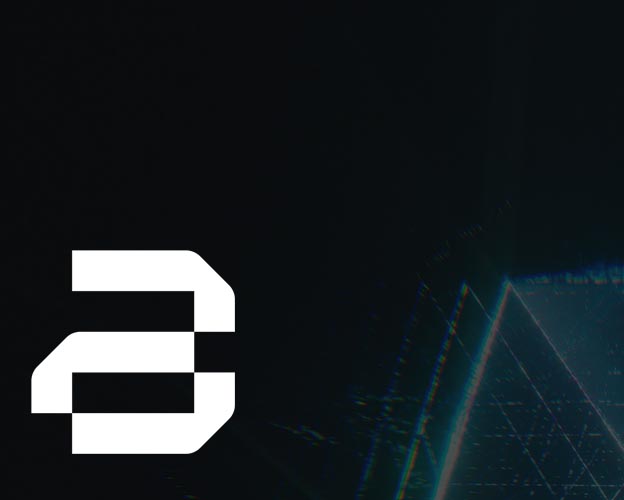
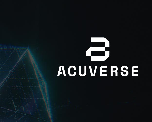
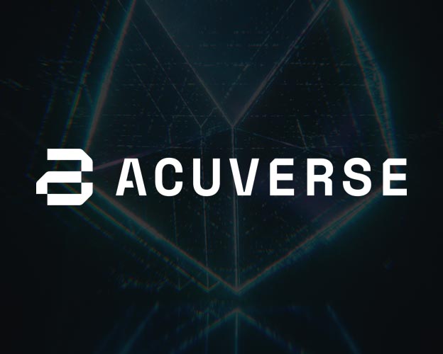
Acuverse's logo features a modern, geometric, and symmetrically balanced design that forms an abstract 'a' using clean lines and interconnected shapes. The visual language communicates precision, innovation, and digital connectivity—perfectly expressing the company's forward-thinking approach to IT development.
The Challenge
Acuverse needed a brand identity that visually reflects its commitment to innovation, technological precision, and digital infrastructure. The challenge was to create a logo that is both minimal and highly symbolic, reinforcing trust and technical expertise.
The Solution
We developed a geometric, interconnected monogram that forms an abstract 'A.' Its symmetrical construction and precise linework symbolize structured systems, seamless connectivity, and modern digital architecture. The simplified yet bold aesthetic ensures strong brand recognition across platforms.
Measurable Impact
Technologies
© 2026 Shihab Saleem. All rights reserved.