Parrot Vacation.
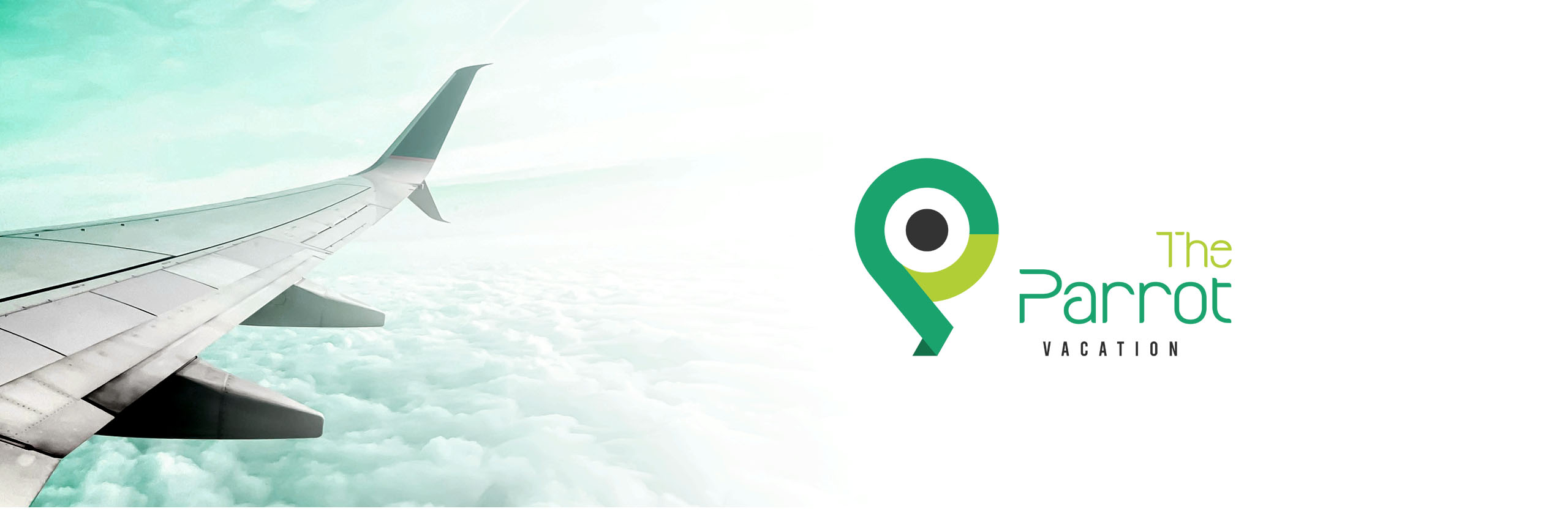
Overview
The Parrot Vacation logo is a modern, minimalist brand mark that seamlessly combines a parrot, a location pin, and the letter ‘P’ into a single cohesive symbol. Inspired by vibrant parakeet colors, the identity captures the essence of travel, freedom, and exploration while maintaining a clean, contemporary aesthetic suited for digital-first platforms.
The Challenge
The challenge was to create a distinctive travel brand identity that feels playful yet professional, while clearly communicating movement, destinations, and a sense of adventure in a simple visual form.
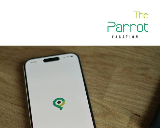
The Solution
We designed a unified symbol that merges meaningful elements into a compact, recognizable mark. A fresh color palette inspired by parakeets enhances visual appeal, while the minimalist form ensures clarity, scalability, and versatility across digital and print touchpoints.

Measurable Impact
Technologies
© 2026 Shihab Saleem. All rights reserved.